Tag Archives: utilitarian

Welcome to the Virtual City – J.G. Ballard

A city built for speed is a city built for success | science fictional.


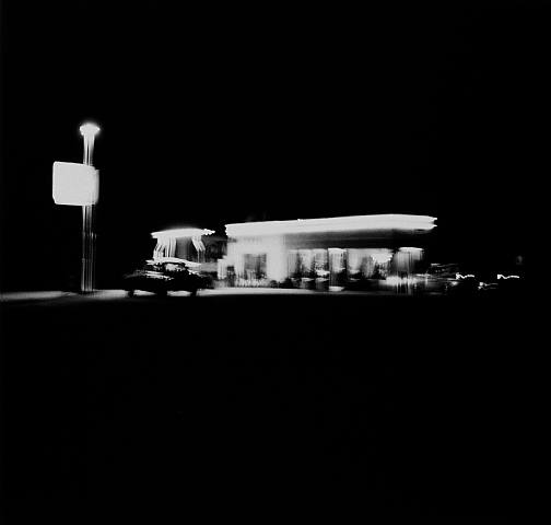
Ed Ruscha, Gasoline Stations, 1989.

Shepperton, for what it’s worth, is not suburbia. If it is a suburb of anywhere, it is of London Airport, not London. And that is the clue to my dislike of cities and my admiration for what most people think of as a faceless dead-land of inter-urban sprawl. Hurrying back from Heathrow or a West Country weekend to their ludicrously priced homes in Fulham or Muswell Hill, they carefully avert their gaze from this nightmare terrain of dual carriageways, police cameras, science parks and executive housing, an uncentred realm bereft of civic identity, tradition or human values, a zone fit only for the alienated and footloose, those without past or future.

And that, of course, is exactly what we like about it. We like the fast dual carriageways, the easy access motorways, the limitless parking lots. We like the control-tower architecture, the absence of civic authority, the rapid turnover of friendships and the prosperity filtered through car and appliance purchases. We like roads that lead past airports, we like air-freight offices and rent-acar forecourts, we like impulse-buy holidays to anywhere that takes our fancy. The triangle formed by the M3 and the M4, enclosing Heathrow and the River Thames, is our zone of possibility, far from the suffocating city politics and self-obsessions of the metropolis (transport, ugh, fares, rents, kerb-side vomit). We are the unenfranchised citizens of the shopping mall and the marina, the internet and cable TV. And we’re in no hurry for you to join us.

J.G. Ballard, “Welcome to the Virtual City”, Tate, Spring 2001. p 33.

Airports: The True Cities of the 21st Century – J.G. Ballard

Airports: The True Cities of the 21st Century – J.G. Ballard.

Ballardian: The World of JG Ballard

Airports, designed around the needs of their collaborating technologies, seem to be the only form of public architecture free from the pressures of kitsch and nostalgia. As far as I know, there are no half-timbered terminal buildings or pebble-dashed control towers.

[…]

For the past 35 years I have lived in Shepperton, a suburb not of London but of London’s Heathrow Airport. The Heathrow-tinged land extends for at least 10 miles south and west, a zone of motorways, science parks, and industrial estates, a landscape that most people affect to loathe but that I regard as the most advanced and admirable in the British Isles, and a paradigm of the best that the future offers us.

[…]

I value the benevolent social and architectural influence that a huge transit facility like Heathrow casts on the urban landscape around it. I have learned to like the intricate network of car rental offices, air freight depots, and travel clinics, the light industrial and motel architecture that unvaryingly surrounds every major airport in the world. Together they constitute the reality of our lives, rather than a mythical domain of village greens, cathedrals, and manorial vistas. I welcome the landscape’s transience, alienation, and discontinuities, and its unashamed response to the pressures of speed, disposability, and the instant impulse. Here, under the flight paths, everything is designed for the next five minutes.

By comparison, London itself seems hopelessly antiquated. Its hundreds of miles of gentrified stucco are a hangover from the 19th century that should have been bulldozed decades ago. I have the sense of a city devised as an instrument of political control, like the class system that preserves England from revolution. The labyrinth of districts and boroughs, the endless porticos that once guarded the modest terraced cottages of Victorian clerks, make it clear that London is a place where people know their place.

At an airport like Heathrow the individual is defined not by the tangible ground mortgaged into his soul for the next 40 years, but by the indeterminate flicker of flight numbers trembling on a screen. We are no longer citizens with civic obligations, but passengers for whom all destinations are theoretically open, our lightness of baggage mandated by the system. Airports have become a new kind of discontinuous city whose vast populations are entirely transient, purposeful, and, for the most part, happy. An easy camaraderie rules the departure lounges, along with the virtual abolition of nationality—whether we are Scots or Japanese is far less important than where we are going. I’ve long suspected that people are truly happy and aware of a real purpose to their lives only when they hand over their tickets at the check-in.

I suspect that the airport will be the true city of the 21st century. The great airports are already the suburbs of an invisible world capital, a virtual metropolis whose border towns are named Heathrow, Kennedy, Charles de Gaulle, Nagoya, a centripetal city whose population forever circles its notional center and will never need to gain access to its dark heart. Mastery of the discontinuities of metropolitan life has always been essential to successful urban dwellers—we know none of our neighbors, and our close friends live equally isolated lives within 50 square miles around us. We work in a district five miles away, shop in another, and see films and plays in a third. Failure to master these discontinuities leaves some ethnic groups at a disadvantage, forced into enclaves that seem to reconstitute mental maps of ancestral villages.

But the modern airport defuses these tensions and offers its passengers the social reassurance of the boarding lounge, an instantly summoned village whose life span is long enough to calm us and short enough not to be a burden. The terminal concourses are the ramblas and agoras of the future city, time-free zones where all the clocks of the world are displayed, an atlas of arrivals and destinations forever updating itself, where briefly we become true world citizens. Air travel may well be the most important civic duty that we discharge today, erasing class and national distinctions and subsuming them within the unitary global culture of the departure lounge.

Gotham (typeface) – Wikipedia, the free encyclopedia

Gotham (typeface) – Wikipedia, the free encyclopedia.

Gotham is a family of widely used geometric sans-serif digital typefaces designed by American type designer Tobias Frere-Jones in 2000. Gotham’s letterforms are inspired by a form of architectural signage that achieved popularity in the mid-twentieth century, and are especially popular throughout New York City.[1]

Since creation, Gotham has been highly visible due to its appearance in many notable places, including a large amount of campaign material created for Barack Obama’s 2008 presidential campaign, as well as the cornerstone of the One World Trade Center, the tower to be built on the site of the former World Trade Center in New York. It is also the current font to be used in title cards for film trailers in the US.

[…]

The Gotham typeface was initially commissioned by GQ magazine, whose editors wanted to display a sans-serif with a “geometric structure” that would look “masculine, new, and fresh” for their magazine. GQ agreed that they needed something “that was going to be very fresh and very established to have a sort of credible voice to it,” according to Jonathan Hoefler.[2]

Frere-Jones’ inspiration for the typeface came from time spent walking block-by-block through Manhattan with a camera to find source material,[3] and he based the font on the lettering seen in older buildings, especially the sign on the Eighth Avenue facade of the Port Authority Bus Terminal. “I suppose there’s a hidden personal agenda in the design,” Frere-Jones said, “to preserve those old pieces of New York that could be wiped out before they’re appreciated. Having grown up here, I was always fond of the ‘old’ New York and its lettering.”[3]

The lettering that inspired this typeface originated from the style of 1920s era sans-serifs like Futura, where “Type, like architecture, like the organization of society itself, was to be reduced to its bare, efficient essentials, rid of undesirable, local or ethnic elements.” This theme was found frequently in Depression-era type in both North America and Europe, particularly Germany.[4] This simplification of type is characterized by Frere-Jones as “not the kind of letter a type designer would make. It’s the kind of letter an engineer would make. It was born outside the type design in some other world and has a very distinct flavor from that.”[2]

Reviews of Gotham focus on its identity as something both American and specific to New York City. According to David Dunlap of The New York Times, Gotham “deliberately evokes the blocky no-nonsense, unselfconscious architectural lettering that dominated the [New York] streetscape from the 1930s through the 1960s.”[5] Andrew Romano of Newsweek concurs. “Unlike other sans serif typefaces, it’s not German, it’s not French, it’s not Swiss,” he said. “It’s very American.”[6]

According to Frere-Jones, Gotham wouldn’t have happened without the GQ commission. “The humanist and the geometric … had already been thoroughly staked out and developed by past designers. I didn’t think anything new could have been found there, but luckily for me (and the client), I was mistaken.”[3]

[…]
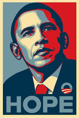
Early materials for the Obama campaign used the serif Perpetua. Later, however, upon hiring John Slabyk, and Scott Thomas, the campaign made the change to Gotham, and the font was used on numerous signs and posters for the campaign.[7]

The International Herald Tribune praised the choice for its “potent, if unspoken, combination of contemporary sophistication (a nod to his suits) with nostalgia for America’s past and a sense of duty.”[8] John Berry, an author of books on typography, agreed: “It’s funny to see it used in a political campaign because on the one hand it’s almost too ordinary yet that’s the point. It has the sense of trustworthiness because you’ve seen it everywhere.”[9] Graphic designer Brian Collins noted that Gotham was the “linchpin” to Obama’s entire campaign imagery.[10]

Observers of the primary and general elections compared Obama’s design choices favorably to those made by his opponents. In her campaign, Hillary Clinton used New Baskerville, a serif used by book publishers, law firms, and universities, while John McCain used Optima, the same font used for the Vietnam Veterans Memorial.[8][11]

[…]

On April 4, 2011, Hoefler and Frere-Jones announced that they had created a new custom version of Gotham with serifs for the use of President Barack Obama’s 2012 campaign. In announcing the news they wrote: “Can We Add Serifs to Gotham? For the President of The United States? Yes We Can.[19] Following the closure of the 2012 US presidential elections, this serif version of Gotham has not yet been released publicly.