Creative Review – Ten Years of Modern Toss.


A Rare Look at Apple’s Design Genius Jony Ive — Vogue.

Ive has a calming presence, like the Apple campus itself, whose very address, Infinite Loop, lulls you into a sense of Zen-ness. In the courtyard, trays of beautiful food—grass-fed steaks and fresh-made curries and California-born hot sauces—lead Apple employees out toward the open-air seating, away from the white cafeteria that might be described as a luxurious spa for the terminally nerdy. White is the color of choice at Apple HQ as in the Apple product line. It is through this white, with its clarity, its dust-hiding lack of distraction, that you have already met Jonathan Ive.
[…]
he is passionate about things, as in things, literally. “So much of my background is about making, physically doing it myself,” he says. In other words, the secret weapon of the most sought-after personal-electronics company in the world is a very nice guy from Northeast London who has a soft spot for woodworking and the sense that designers ought to keep their design talents backstage where they can do the most good.
[…]
“I wish I could articulate this more effectively,” he continues, addressing his ambitions as a designer. “But it is to have that sense that you know there couldn’t possibly be a sane or rational alternative.”
[…]
It may be easier to sneak into a North Korean cabinet meeting than into the Apple design studio, the place where a small group of people have all the tools and materials and machinery necessary to develop things that are not yet things. Reportedly Ive’s wife, Heather Pegg, has never been—he doesn’t even tell her what he’s working on—and his twin sons, like all but a few Apple employees, are not allowed in either. Work is conducted behind tinted windows, serenaded by the team’s beloved techno music, a must for the boss. “I find that when I write I need things to be quiet, but when I design, I can’t bear it if it’s quiet,” he says. Indeed, the design team is said to have followed an unwritten rule to move away from their work whenever the famously brusque Jobs entered the studio and turn up the volume so as to make his criticisms less audible, less likely to throw them off course.
[…]
“if you tasted some food that you didn’t think tasted right, you would assume that the food was wrong. But for some reason, it’s part of the human condition that if we struggle to use something, we assume that the problem resides with us.”
[…]
His father, Michael Ive, is a silversmith, and his grandfather was an engineer. When Ive was a boy, his father worked with the British government to develop and set the standards for design education. When he made things with his son—a toboggan, say—he would demand that Jony sketch his design before commencing construction.
[…]
Five years later, a disenchanted Ive was about to leave when Jobs returned to reboot the then-floundering Apple, which happened, by most analyses, when Jobs enabled Ive. By Ive’s account, the two hit it off immediately. “It was literally the meeting showing him what we’d worked on,” Ive says, “and we just clicked.” Ive talks about feeling a little apart, like Jobs. “When you feel that the way you interpret the world is fairly idiosyncratic, you can feel somewhat ostracized and lonely”—big laugh here—“and I think that we both perceived the world in the same way.”
[…]
Design critics now look back at the birth of the Jobs-Ive partnership as the dawn of a golden age in product design, when manufacturers began to understand that consumers would pay more for craftsmanship. Together Jobs and Ive centered their work on the notion that computers did not have to look as if they belonged in a room at NASA. The candy-colored iMac—their first smash hit—felt to consumers like a charming friend, revolutionary but approachable, and appealed to both men and women.
[…]
Throughout, Ive has refined Apple’s design process, which, he argues, is almost abstract in its devotion to pure idea: Good design creates the market; ideas are king. And here’s the next irony that defines Ive’s career: In the clutter of contemporary culture, where hits and likes threaten to overtake content in value, the purity of an idea takes on increasing currency. “I think now more than ever it’s important to be clear, to be singular,” he says, “and to have a perspective, one you didn’t generate as the result of doing a lot of focus groups.” Developing concepts and creating prototypes leads to “fascinating conversations” with his team, says Ive. “It’s a process I’ve been practicing for decades, but I still have the same wonder.”
[…]
“My boys are ten, and I like spending time with them doing stuff that I did, which is drawing and making things—real things, not virtual things,” he says. Easygoing Ive morphs into Serious Ive on this point: He sees design schools failing their students by moving away from a foundation in traditional skills. “I think it’s important that we learn how to draw and to make something and to do it directly,” he says, “to understand the properties you’re working with by manipulating them and transforming them yourself.”
[…]
On a recent birthday, Tang received two finely crafted wooden boxes containing large, engraved, Ive-designed ashtrays—Tang loves cigars—constructed from the next-generation iPhone material. “It was like getting the monolith in 2001: A Space Odyssey,” Tang says. Ive likes nothing better than to come up with mischievously inventive ways to use the technology at his fingertips. When a presenter from Blue Peter—Britain’s longest-running children’s TV show, known for encouraging kids to craft utilitarian designs from household objects—came to present him with its highest honor, a gold Blue Peter badge depicting a ship in full sail, Ive was delighted. In repayment, he fired up a Mikron HSM 600U, a computer-controlled machine that can cut up a chunk of aluminum like an origami flower, and in a mere ten hours created a Blue Peter badge that looked a lot like a not-so-distant cousin of the MacBook Air.
[…]
“Shit we hate,” says Newson, includes American cars. “It’s as if a giant stuck his straw in the exhaust pipe and inflated them,” he adds, “when you look at the beautiful proportions in other cars that have been lost.”
[…]
The watch underscores the fact that Ive is first and foremost a masterly product designer; technology almost comes second. It’s a beautiful object, a device you might like even if you don’t like devices. “Everything we’ve been trying to do,” he says, “it’s that pursuit of the very pure and very simple.”
[…]
“You just press this button and it slides off, and that is just gorgeous,” he was saying. He encouraged you to pause. “But listen as it closes,” he said. “It makes this fantastic k-chit.” He was nearly whispering. And when he said the word fantastic, he said it softly and slowly—“fan-tas-tic!”—as if he never wanted it to end. Aside from all the ways the watch connects to your phone, Ive is very interested in how the watch can connect to another human. “You know how very often technology tends to inhibit rather than enable more nuanced, subtle communication?” he asks. This is the question that haunts the son of a craftsman: Is he making tools that improve the world or shut people down? “We spent a lot of time working on this special mechanism inside, combined with the built-in speaker” —he demonstrates on his wrist. You can select a chosen person, also wearing the watch, and transmit your pulse to them. “You feel this very gentle tap,” he says, “and you can feel my heartbeat. This is a very big deal, I think. It’s being able to communicate in a very gentle way.”


How might the promise of what at the time was called an “internet of things” play out in the near future? What would the future look like in a world blanketed by advances in protection and surveillance technologies? If Autonomous Vehicle innovations continued its passionate race forward, what would it be to pick up the groceries, take a commercial airline flight, commute to work, have mail and parcels delivered, drop off the dry cleaning, meet friends at a bar across town, go on cross-country family vacations, or take the kids to sports practice or school? Would food sciences offer us new forms of ingestible energy such as coconut-based and other high-caloric energy sources, or caloric burners that would help us avoid exercise-based diets? In what ways would live, streaming, recorded and crowd-authored music and filmed entertainment evolve? How might advances in portable spring power hold up against traditional chemical battery power? How would emerging forms of family and kinship be reflected in social networks? How will Chinese migration to Africa shape that continent’s entry into the world of manufacturing, and how would that inevitability shape distribution and production economies? What is to become of open-source education and the over-supply of capable yet unemployed engineers? Would personal privacy and data hiding protocols be developed to help protect our families and businesses from profile pirates and data heists? What happens to our sense of social relations as today’s algorithmic analytic interpersonal relationship matchers get too good and algorithms effectively pre-pubscently “couple us off” before we have a chance to experience the peculiarities of dating life? Will crytocurrency disrupt today’s national currencies? What will become of coffee and plant-based protein products?
[…]
Ultimately though, our task was to decant even the most preposterous idea through a series of design procedures that would make it as normal, ordinary, and everyday blasé as, for one retrospective example, the billions of 140-character messages sent into the ether each day – a form of personal individual communication that must have, at its inception, seemed to most of the world to be the most ridiculous idea ever. The point being that the most extraordinary preposterous social rituals have often made their ways into our lives to become normal and even taken for granted.
A report (or catalog, such as TBD) offers a way to normalize those extraordinary ideas and represent them as entirely ordinary. We imagined it to be a catalog of some sort, as might appear in a street vending box in any neighborhood, or in a pile next to the neighborhood real estate guides or advertising-based classified newspapers near the entrance to your local convenience store.
[…]
Rather than the staid, old-fashioned, bland, unadventurous “strategy consultant’s” report or “futurist’s” white paper (or, even worse – bullet-pointed PowerPoint conclusion to a project), we wanted to present the results of our workshop in a form that had the potential to feel as immersive as an engaging, well-told story. We wanted our insights to exists as if they were an object or an experience that might be found in the world we were describing for our client. We wanted our client to receive our insights with the shift in perspective that comes when one is able to suspend their disbelief as to what is possible.
[…]
During our workshop, we used a little known design-engineering concept generation and development protocol called Design Fiction. Through a series of rigorous design procedures, selection protocols, and proprietary generative work kits, Design Fiction creates diegetic and engineered prototypes that suspend disbelief in their possibility. Design Fiction is a way of moving an idea into existence through the use of design tools and fictional contexts that results in a suspension of one’s disbelief, which then allows one to overcome one’s skeptical nature and see possibility where there was once only skepticism or doubt.
There were a variety of tools and instruments we could put in service to construct these normal ordinary everyday things. For example, several canonical graphs used to represent trajectories of ideas towards their materialization would come in handy. These are simple and familiar graphs. Their representations embody specific epistemological systems of belief about how ideas, technologies, markets, societies evolve. These are typically positivist up-and-to-the-right tendencies. With graphs such as these, one can place an idea in the present and trace it towards its evolved near future form to see where its promise might end up.
We also had the Design Fiction Product Design Work Kit, a work kit useful for parceling ideas into their atomic elements, re-arranging them into something that, for the present, would be quite extra-ordinary. But, in the near future everyday, would be quite ordinary.
[…]
No. Not prediction. Rather we were providing thought provocations. We were creating a catalog of things to think with and think about. We were creating a catalog full of creative inspiration for one possible near future – a near future that would be an extrapolation from todays state of things. Our objective was to create a context in which possible-probables as well as unexpected-unlikelies were all made comprehensible. Were one to do a subsequent catalog as a reflection on another year, it would almost certainly be concerned with very different topics and, as such, materialize in a rather different set of products.
[…]
There were no touch-interaction fetish things like e-paper magazines, no iPhones with bigger screens, no Space Marine Exo-Skeletons, no time-traveling devices, not as many computational screen devices in bathroom medicine cabinets as one may have hoped or feared. There was no over-emphasis on reality goggles, no naive wrist-based ‘wearables’, a bare minimum of 3D printer accessories. Where those naive futures appeared we debased them – we represented them with as much reverence as one might a cheap mass-produced lager, an off-brand laundry soap, or an electric toothbrush replacement head. We focused on the practicalities of the ordinary and everyday and, where we felt necessary, commoditized, bargainized, three-for-a-dollarized and normalized.
What was most interesting is that the deliverable – a catalog of the near future’s normal ordinary everyday – led us in a curious way to a state that felt rather like the ontological present. I mean, the products and services and “ways of being” were extrapolated, but people still worried about finding a playmate for their kid and getting out of debt. As prevalent as ever were the shady promises of a better, fitter, sexier body and new tinctures to prevent the resilient common cold. People in our near future were looking for ways to avoid boredom, to be told a story, find the sport scores or place a bet, get from here to there, avoid unpleasantries, protect their loved ones and buy a pair of trousers. Tomorrow ended up very much the same as today, only the 19 of us were less “there” than the generations destined to inherit the world designed by the TBD Catalog. Those inheritors, the cast of characters we imagined browsing and purchasing from this catalog in the near future, seemed to take things in stride when it came to biomonitoring toilets, surveillance mitigation services, luxurious ice cubes, the need for data mangling, living a parametric-algorithmic lifestyle, goofy laser pointer toys, data sanctuaries, and the inevitable boredom of commuting to work (even with “self-drivers” or other forms of AV’s.)
[…]
The near future comes pre-built with the expectation that, being the future, it must be quite different from the vantage point of the present. This is an assumption we were trying to alter for a moment – the assumption that the future is either better or worse than the present. Quite less often is the future represented as the same as now only with a slightly different cast of characters. Were we to take this approach, which we did, it would be required that the cast of characters from the future would be no more nor less awestruck by their present than we are today awestruck by the fact that we have on-demand satellite maps in our palms, that the vapor trail above us is a craft with hundreds of souls whipping through the stratosphere at breakneck speeds, and that when we sit down at a restaurant fresh water (with ice) is offered in several varieties from countries far away, with or without bubbles.
[…]
It was important that the concepts be carefully represented as normal, rather than spectacular. Were things to have a tinge of unexpected social or technical complexity as suggested, for example, by regulatory warnings, a hint of their possible mishaps, an indication that it may induce a coronary or require a signed waiver — all the better as these are indications of something in the normal ordinary everyday.
[…]
the near future may probably be quite like the present, only with a new cast of social actors and algorithms who will, like today, suffer under the banal, colorful, oftentimes infuriating characteristic of any socialized instrument and its services. I am referring to the bureaucracies that are introduced, the jargon, the new kinds of job titles, the mishaps, the hopes, the error messages, the dashed dreams, the family arguments, the accidental data leak embarrassments, the evolved social norms, the humiliated politicians, the revised expectations of manner and decorum, the inevitable reactionary designed things that reverse current norms, the battalions of accessories. Etcetera.
Also, concepts often started as abstract speculations requiring deciphering and explication. These would need to be designed properly as products or services that felt as though they were well-lived in the world. Predictive design and speculative design lives well in these zones of abstraction. To move a concept from speculative to design fictional requires work. To materialize an idea requires that one push it forward through the gauntlet any design concept must endure to become the product of the mass-manufacturers process of thing-making. To make an idea become a cataloged, consumable product in the world requires that it be manufacturable, desirable and profitable. Each of these dimensions in turn require that, for example, the thing be imagined to have endured regulatory approvals, be protected as much as possible from intellectual property theft, be manufactured somewhere, suffer the inevitable tension between business drivers, marketing objectives, sales goals and design dreams while also withstanding transcontinental shipping, piracy of all kinds, the CEO’s wives color-choice whims (perhaps multiple CEOs over the course of a single product’s development) and have a price that is as cheap as necessary in many cases but perhaps reassuringly expensive in others. Things need to be imagined for their potential defects, their inevitable flaws and world-damaging properties. A product feels real if it has problems it mitigates as well as new, unexpected problems it introduces. Things need names that are considered for certain categories of product, and naive or imbecilic for others. Things need to be imagined in the hand, in use in “real world” contexts – in the home, office, data center, one’s AV, amongst children or co-workers. They should be forced to live in their springtime with fanfare, and their arthritic decline on the tangled, cracked and chipped 3/99¢ bin. To do this requires that they live, not just as flat perfect things for board room PowerPoint and advertisements, but as mangled things co-existing with all of the dynamic tensions and forces in the world.
[…]
Ultimately, things are an embodiment of our own lived existence — our desires and aspirations; our vanities and conceits; our servility and humility. A Design Fiction catalog of things becomes an epistemic reflection of the times. One might read such a catalog as one might read a statement titled “The Year In Review” – a meditation on the highlights of a year recently concluded. This would not be prediction. It would be a narrative device, a form of storytelling that transcends naive fiction to become an object extracted from a near future world and brought back to us to consider, argue over and discuss. And, possibly, do again as an alternative to the old journalistic “The Year In Review” trope. Is there a better name or form for the thing that looks forward with modesty from today and captures what is seen there? What do we call the thing that stretches into the near future the nascent, barely embryonic hopes, speculations, hypotheses, forces, political tendencies – even the predictions from those still into such things? Is it Design Fiction? An evolved genre that splices together naive fiction, science-fiction, image-and-graphic mood boards and the now ridiculously useless ‘futurist’ predictions and reports? Something in between crowd-funding as a way to prototype a DIY idea and multiform, transmedia shenanigans?
[…]
We started receiving inquiries from individuals around the world who wanted to order items and provide crowd-funding style financial backing for product concepts. Some entities demanded licensing fees because a product the “catalog” purported to “sell” was something they had already developed and were selling themselves or, in some cases, they had even patented and so were notifying us that they would pursue legal remedies to address our malfeasance.
We found that products and entire service ecosystems we implied through advertisements actually existed in an obscure corner of the business world. Of course, there were items in the catalog that we knew existed already. In those cases, our task was not to re-predict them, but to continue them along their trajectory using one or a combination of our graphs of the future (see following pages). In these cases, it can be expected that an unwitting reader of TBD Catalog would naturally make contact with us to find out why they had not be made aware of the new version of the product, how could they get a discounted upgrade, or how they could download the firmware update for which they simply had not already been aware.
[…]
One could write quite didactically about innovation of such-and-so, or make a prediction of some sort or commission a trend analysts report or a clever name-brand futurists’ speculation. Or, one could start with the names of some things and fill out their descriptions at their “consumer face” and let the things themselves come to life, define the sensibilities of those humans (or algorithms?) that might use them. How would those things be sold – what materials? what cost? what consumer segment? Three-for-one? Party colors? Or one could do a very modern form of combined prototyping-funding such as the ‘Kickstarter model’ of presenting an idea before it is much more than a collection of pretty visual aids and then see what people might pay for an imaginary thing. Design Fiction is the modern form of imagining, innovating and making when we live in a world where the future may already have been here before.

Eye Magazine | Feature | Meta’s tectonic man.

FF Meta on the ZVV Nighttime network map, Zurich

Invitation Retail Design Conference, 2012 (FF Meta Serif and FF Meta)

Stamo ‘Liberalisme’, Belgium, 1996

Book cover Hermann Hesse biography (Suhrkamp)
Erik Spiekermann is a consummate pluralist. Able to move, seemingly without effort, between roles as a typographer, designer, writer, public speaker and merchandiser, he was once even a politician – A Green Party member of the Berlin Senate. Spiekermann is the author of Stop Stealing Sheep and Rhyme & Reason – two models of typographic rectitude for a lay audience – and the articulate upholder of standards of public design in many a conference lecture. He is the designer of Meta, one of the most successful typefaces of this decade, and founder of the typeface distribution company FontShop.
[…]
‘I am a typographic designer. A typographic designer starts from the word up; a graphic designer starts from the picture down.’
[…]
But how, then, does Spiekermann distinguish his approach from that of an avowed graphic designer such as Gert Dumbar?
‘Dumbar always uses space. He can’t have three-dimensional space because paper is flat, so instead he uses cross-sections – he dissects objects in space and puts them on the flat page. He is a spatial kind of image guy: he thinks in theatrical terms. I think in page terms. The page is the lowest common denominator of the book system. The page is the molecule and the atom is the word. You see, I read. I read before I design, and I write. I design outwards from words.’
[…]
His conversation is a stream of aphorism and metaphor. On national stereotypes in graphic design, for instance, we learn: ‘France is olive shaped; Holland is triangular, always very pointy and narrow; Germany is very square; and England is round.’ And on being a designer: ‘I am a servant, I’m not an artist. If I was an artist I would be oval, like an olive.’
As a typographic designer, however, Spiekermann is distinctively quadrilateral. His trademarks are a rectangular or braced bar that bleeds off the page and a palette of just two colours – black and red, in the craft tradition. While he is generous with words, Spiekermann is extremely parsimonious when dispensing colour, shape and typographic variation.
[…]
He has written that his intention for Meta was that it be ‘neutral design – not fashionable, nor nostalgic’, yet also ‘unmistakable and characteristic’. As far as is possible, these apparently mutually exclusive aims are resolved in the finished version. Meta has a News Gothic base – neutral – with an exaggerated contrast between bowl and counter-shapes for legibility and highly distinctive curved and flared (or ‘pseudo-serif’) stems. The fact that it has become the height of typographic fashion is ironic rather than blameworthy. Meta is a blue-collar typeface, workmanlike, practical, sleeves rolled up ready to do a job. It is well-balanced, neither pretty nor elegant, pragmatic but not unprincipled – not unlike its maker. Spiekermann is contemptuous of modern type which puts geometric harmony before contrast and therefore before legibility (he means Helvetica) and of highly formalised, theoretical design. ‘I detest Rotis,’ he says with enthusiasm. ‘It’s overstarched, too perfect. I like to leave some dirt in my work, some imperfection. That’s why I like deadlines and budgets, otherwise the work can be too finished.’
‘Legibility is not communication; but in order to communicate type has to be legible’ is a truism with which MetaDesign likes to decorate its stationery. Another company motto, ‘My role is to communicate my client’s message – not my own’, sounds self-righteous until Spiekermann elaborates by adding the notion of interpretation, removing the conceit of objectivity. ‘What I like to do most is to interpret a message so that people can understand it. At the same time I like to add colour, in the journalistic sense, by using colourful language, in my case visual language.’
This is another compromise, between the mechanical constraints of legibility and the creation of a pleasing visual narrative, or simply of variety – legibility is qualified by readability. Information design and public signage have usually been regarded as zones of pure functionality in which there is no need to persuade people to want to read. But according to Spiekermann, the communication of hard information may be enhanced rather than impaired by the stimulation of the brain’s emotional centres. The trick (the word is used advisedly, it implies sleight of hand) is to add colour without sacrificing clarity. You can see the theory in action in MetaDesign’s timetable for the BVG, with its simple elaborated typography bounded by tectonic elements – bars, arrows, circles, each doing a job of signage – and underlaid by a page-sized circle in a contrasting tint out of which the bus number is printed. There is a manifest danger that this will make the timetable harder to read, in direct proportion to the extra visual stimulus it provides. The dilemma is solved by the change of scale between the display and the text faces, which forces the eye to focus on one or the other, rarely both.
The same principle is applied to the signage system for the newly unified Berlin underground and overground railways. MetaDesign exploits the riot of colour provided by the inherited coding of 19 different S-bahn, U-bahn and regional lines and adds to it the favourite brew of squares, pictograms, arrows and bars to grab attention and indicate direction. The result is noisy, a striking contrast to, for instance, Vignelli’s frankly dreary scheme for Milan or his austere, industrial New York subway signage. Does it work? Nobody knows. Sitting and consistency of implementation are at least as important as typography in a system as complex as Berlin’s city transport, yet MetaDesign has had almost no control over the way its work has been used and there has been no systematic evaluation of its success through pilot programmes. Spiekermann regrets this, of course. Many signs are poorly positioned and carry too much information and he would like to know how effective the system is.
The problem with such projects lies in establishing the boundaries of graphic (or typographic) design: where does graphics end and behavioural science begin? And how are clients to be persuaded to give designers greater responsibility? MetaDesign has provided good answers to both these questions in its corporate design work. But in information design, where the client is usually a state enterprise or city council, political manoeuvring and committee mentality foster conservatism. Spiekermann continues to complain that what the subway signs say and where they are placed are beyond his control.
MetaDesign preceded its work for BVG with a subjective study of how people act on the underground. The designers went to the stations, looked and learned, yet Spiekermann remains suspicious of schemes based on objective scientific analysis: ‘You know what to do from experience and intuition. You don’t have to go down the research route. Cognitive science ignores the fact that people are fuzzy, meaning out of focus – they have all sorts of personal preoccupations and don’t all act the same way.’ Spiekermann prefers to rely on his ‘designer’s instinct’, his informal rationalism and non-aligned, undogmatic common sense. Though he can draw on empirical and quantative studies of legibility and has evolved his own heuristic approach to readability, these lack the force to move German bureaucracy.
To recognise that the education of clients is as important as the genius of the designer is to lose innocence, to mature. The complete designer must be acquainted with the baser skills of persuasion, cunning and diplomacy. Spiekermann, who possesses the first two but lacks the third, used to protest too much that jobs turned out badly because of the client’s short-sightedness. Now, when I ask him what are his ambitions for MetaDesign, he responds immediately: ‘We must become more professional.’ This means, for instance, that MetaDesign now employs a psychologist to orchestrate client presentations and to persuade the designers to work in teams.
[…]
The method which might be said to be grounded in the principles of typographic design, consists in devising a framework of constants and variables based on proportion, orientation, spatial arrangement, colour and, of course, type, which combine to form a distinctive but flexible system. ‘A system offers an infinite number of possibilities,’ observes Spiekermann, ‘and a scheme is dead.’
Proportion is the fundamental constant. ‘I always use what we call rational proportions,’ says Spiekermann. ‘There are 20 rational rectangles, for example. The golden section is one, the DIN section another, 2:3, 4:3, et cetera. Proportion is the common denominator of any page or surface and it provides the basic discipline, out of which we derive the grid, and then add colour: the grid for reason, the colour for emotion.’ But Spiekermann himself uses only two colours: red and black. He admits that his colour sense is undeveloped: ‘Maybe deliberately so, I don’t know. But I certainly don’t trust it. I know colours are emotional and I don’t want to make a statement exactly about it, but … ’. For once he is nonplussed, because MetaDesign and Spiekermann are no longer synonymous, though he remains its primary force. He recovers, ‘Uli is our colour woman. She’s absolutely brilliant. She spends half an hour with a Pantone book and comes up with amazing colour combinations.’
Colour is used in a confined way, almost always within rational shapes, most commonly the bar or broken rectangle. Usually Spiekermann – or rather MetaDesign, for all its designers follow the same principle – will bleed the bar to provide a dynamic tectonic element which defies the arbitrary confines of the page. This element is common to Spiekermann’s personal card, his type specimen sheets and forms for Berthold, MetaDesign’s stationery, the Berlin city identity, the identity for Cologne-based radio station WDR, the Berlin railway signage, et cetera. The BVG identity does not include the bleed, but only because the client forbade it.
We spent a long time talking about this device, long enough for Spiekermann to begin to bristle. ‘How can we spend so much time talking about a stupid piece of rectangle?’ But is there not a danger that the elements of the system are too repetitious? Might not the DIN style be replaced by an equally ubiquitous Spiekermann style?
The answer combines attack with defence. In attack: ‘The device is used for obvious reason. It’s tectonic: it’s a roof, it’s the slab across the door. The square denotes territory, and it works like a colon, pointing somewhere , and like a hand on a shoulder it is possessive, saying “this belongs to this”; it represents the corporate embrace.’ In defence: ‘I must admit I am always appalled when I’m doing another tectonic element, but the page is tectonic, the page is rectangular – I didn’t invent it. I agree with you, there is a danger. I have a very limited box of tricks, but it is because they are so obvious and so rational. Yet despite this few people use them because they are trying so hard to be clever or to excel, or they simply cannot see the obvious.’
‘Don’t forget,’ he adds, ‘that I have to stay within my cultural framework otherwise I won’t communicate.’ I am reminded that the cultural framework is German. I think of the Lufthansa in-flight magazine I flipped through on the plane, set in three sizes of one weight of Helvetica, looking about as convivial as a mail-order catalogue for plumbing equipment. It helps me to understand why, when contemplating acts of typographic non-conformity as minor as making 7 point caption type bolder rather than lighter, Spiekermann cannot help a devilish glint coming to his eye. In Germany there is a way of doing things and you diverge from the norm – The Deutsche Industrie Normen – only at your peril.
The strength and flexibility of MetaDesign’s systematic approach is evident in the brevity of its corporate design manuals, which tend to contain a set of principles rather than a dictionary of canon law in which the design of every last item of stationery, product packaging or delivery vehicle livery is set in stone. ‘An identity manual is not stable – it must react to change within the company,’ says Mayer. This approach is symptomatic of the way digital production has transformed the nature of corporate design. Creating systems for use by non-designers is now an increasingly important process, as is the implementation of production systems, the installation of templates, logotypes and pi-fonts, and putting database management systems in place. These are all skills Spiekermann has nurtured since his work with Berthold in the mid 1980s. MetaDesign’s practice is based on the belief that without due attention to this larger part of any corporate design programme – consultation, implementation, training and maintenance – its visible manifestation will be weak and incomplete. The method exposes the fallacy that graphic design is solely about the creation of good-looking visual images – here it is as much about enabling others to create. In stark contrast with the heroic designer / client relationship of the past in which the designer sought direct access to an aristocratic chief executive, MetaDesign seeks consultation at every level in order to command support and participation. As a consequence, its solutions have tended to towards distributed, modular forms and away from monolithic identities.
[…]
MetaDesign is marked by consistent ingenuity and quality – Qualität, to use the nation’s favourite expression – rather than by creativity or pictorial brilliance. Indeed, its pictorial work is sometimes heavy and unimaginative by British or Dutch standards, but like Spiekermann himself, most of its designers are trained to start from the word rather than from the image. As Spiekermann says, ‘I provide the grammar. I’m the modest guy in the background. Nobody ever said, “Wow, what a great grid”.’
MetaDesign’s character is derived to a large extent from Spiekermann’s own motivation, which is the promotion of a high standard of public life rather than the private pursuit of transient beauty. He says he became a designer to change things that annoyed him as a citizen: ‘I use the underground every day, I use forms every day, I use my city every day. Street furniture, signage advertising – their standard is a measure of the quality of life. That’s why design, that kind of design, is so important to me – it is the interpreting of data, it is making the world accessible.’
[…]
Spiekermann is clearly happiest when the words he communicates can be seen to serve the public good. I suspect that in this respect, he is a citizen before he is a designer. He undoubtedly adheres to notions of ‘good taste’ and is something of an aesthete, but if the typographic designer in him has any moral superiority, it lies in his conviction that the meaning of words is more important than how they look. What words look like matters so that they will be noticed and understood. For Spiekermann, typographic rigour is about the preservation of literacy and efficient communication and not, as with some other sticklers in his own country and abroad, a fetish for what is pure and correct.
Creative Review – Front to back: Hack Attack.

Hack Attack is Guardian special correspondent Nick Davies‘ account of how he helped to expose one of the biggest media scandals of recent times, centred on the newsroom at The News of the World. In our latest Front to Back, Vintage senior designer James Jones takes us through his cover design for this explosive title…
[…]
“To begin with I kept things simple,” he says, “with some typographic versions mimicking newspaper headlines. The initial idea was to screen print these to give them a more textured feel but they lacked any authority and looked pretty much like every other ‘newspaper scandal’ book out there.”
[…]
“I experimented with some earlier ideas which were more conceptual, running with the ‘many layers’ theme by visually representing the phones hacked and the amount of people affected by the Murdoch empire.
“Repeated sim cards, photocopied images of Murdoch and mobiles were used to create some more graphic visuals. And it was here where I first started using a more typographic approach to the cover. Each letter used is a typeface from the newspapers mentioned within the book, hinting at their involvement within the scandal and in pursuing justice.
“This also allowed me to take the subtitle and use it as part of the design, utilising even more typefaces and ripped newspaper articles to make the Murdoch outline, but it was felt this may be too gimmicky (although I still hold a soft spot for them). A sim card border also came out of this process which divides the title and subtitle and also represents those hacked”
“The final design came from me stripping back all these ideas and using all the elements that were working from start to finish,” says Jones.
“The different typefaces, the sim card patterns, the phone as part of the type and the newspaper texture all came from previous visuals. The final version includes some gold foil for the sim cards on a nice textured stock to give it that newspaper feel.”


An Idea Whose Time Has Come – Metropolis Magazine – June 2013.
Billy Wilder’s The Apartment

Living Office concept by Herman Miller
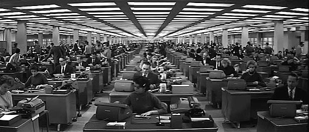
In Billy Wilder’s 1960 comedy The Apartment, an anatomization of sex and power in the white-collar workplace that anticipated Mad Men by half a century, the great director offered a brutally funny, spot-on portrait of the postwar office, depicting the fictitious Consolidated Life of New York as a cornfield-size, perfectly rectilinear grid of anonymous, identical desks. How long ago and far away that seems. Though in places the old model still prevails, today’s ideal office paradigm could not be more different: fluid rather than fixed, less hierarchical and more egalitarian, and encouraging (mostly) of individuality, creativity, and choice.
A new story requires a new stage, and into this brave new world comes Herman Miller’s Living Office, the initial components of which the Zeeland, Michigan, furniture company is introducing at this year’s edition of NeoCon. The first wave of an anticipated two-year rollout, the Living Office’s first three product portfolios—called PUBLIC Office Landscape, Metaform Portfolio, and Locale, and designed, respectively, by fuseproject, Studio 7.5, and Industrial Facility—represent the company’s carefully considered response, not only to the ways in which a changed business culture has transformed workplace design, but to where our personal aspirations may be headed, and how the office can support them.
It’s a resolutely forward-looking vision. Yet this emphasis on what the company calls “human-centered problem-solving” has been the hallmark of Herman Miller since 1930, when Gilbert Rohde, its first design director, famously declared, “The most important thing in the room is not the furniture—it’s the people.”
In fact, the past is prologue to the Living Office in a central way—specifically, a slender, significant book, published in 1968, called The Office: A Facility Based on Change, by Robert Propst, at the time the company’s head of research. Under George Nelson, the second design director, Herman Miller had produced many of postwar America’s most iconic objects, by the likes of Charles and Ray Eames, Isamu Noguchi, and others, including Nelson himself. But by the late 1950s, the residential and commercial businesses had plateaued, and the company’s out-of-the-box-thinking president D.J. DePree began casting about for untapped revenue streams. DePree discovered Propst at the 1958 Aspen Design Conference, and was immediately taken with the artist/teacher/inventor. “Propst was truly brilliant, an innovative thinker,” explains Mark Schurman, Herman Miller’s corporate communications director. “D.J. figured, ‘We’ll set him up with a research division, and he’ll find new opportunities.’ One of his first directives was, ‘Anything but furniture.’”
Despite the company’s mandate, Propst became increasingly absorbed by the idea of reinventing the office, an interest that dovetailed with Nelson’s, who as early as 1948 had talked about the ideal working environment being a “daytime living room” that would be welcoming and humane. Propst, too, concerned himself with the human factor—specifically how flexible floor plans and porous, intercommunicating spaces might empower both the individual and the organization.
[…]
Action Office II’s 12 “principles of operation,” encouraged a workplace in which “the individual can participate in goal setting and thus behave like a manager at any level.” Propst’s environment remained “responsive to the goals of the user,” changed gracefully and with minimal disruption, and enabled rapid replanning. It also thrived on contrast: between neatness and chaos, sitting and standing, solitude and collaboration, privacy and community, and, critically, “geometry versus humanism”—that is, a traditional, grid-based floor plan versus a more organic layout.
[…]
Alas—and despite Propst’s injunction against the “four-sided enclosure”—by the late 1970s, the dominant application of the Action Office (and its multiple imitations) had become that most despised of office conditions: the cubicle. Propst, who died in 2000, had sought to liberate humankind from the grid, but his invention wound up locking the worker even more tightly into it.
Yet good ideas die hard, and the Living Office—which expresses Propst’s vision in a new-century way—suggests that, 45 years on, it’s an idea whose time has come. For one, when the Action Office appeared, the world depicted in Wilder’s film had its roots in the blue-collar assembly line, an essentially Victorian model. “There was a small group of people who made decisions, and a whole lot of people lined up executing,” says Greg Parsons, Herman Miller’s vice president of New Work Landscape. Today, Parsons points out, “the office is a facility based on creativity, and we need an organizational structure that reflects that.” As well, the anchoring effects of technology, which worsened in the 1980s and 1990s as ever more devices appeared, have been swept away in our wireless world. Both philosophically and physically, the office is far more flexibility-friendly than it was a half-century ago.
No less important is what might be called the Marissa Mayer Effect. Though the Yahoo! CEO’s ban on work-from-home may have been poorly handled, according to Gary Smith, director of design facilitation and exploration at Herman Miller, her point was powerful. “We’re talking about a shift of emphasis, away from housing and technology, capabilities that could exist only in the office,” Smith explains. “Now there’s a different thing that can exist only in the office, and that’s my access to you. I want to tap your potential, because what humans do best is connect and communicate”—something the Living Office is meant to encourage, by creating a multiplicity of differently scaled settings and making the connections between them more logical, adjustable, and fluid.
In keeping with its people-first philosophy, the company focused its predesign research on gathering insight, not information. “Research will expose the manifest behavior of a population, but it won’t reveal innovation,” observes Smith. Instead, Parsons says, “We asked, ‘What’s going on in the world? What’s fundamental about all human beings, and what do they really want to do?’” Toward this end, Herman Miller engaged in a process that Maryln Walton, of the insight and exploration group, describes as “informed dreaming.” Since 2001, the company has completed three rounds of scenarios, in which it looks five years ahead at potential futures; these enable the company to think about how the world might change, and adjust its product development and business strategies accordingly. The brainstorming process begins with a dozen people from different parts of the organization, followed by a two-day “expert workshop” with six individuals representing multiple disciplines—the most recent, which looked ahead to 2018, included two cultural anthropologists, a specialist in Asian HR policies, and a political science professor—to challenge the in-house assumptions.
The team then takes what it’s learned and imagines (and reimagines) the future until it arrives at three possible scenarios. For 2018, these include Datasphere, which looks at how the digital information generated by individuals worldwide can be innovatively repurposed; New Normal, a consideration of potential push-back against organizations, institutions, and governments; and Polarized World, in which the U.S. and China emerge as the two great economic powers. “We ran workshops with groups of people thinking about each scenario,” Walton says. “Then we spent a lot of time synthesizing the results, and developed what we believe are likely workplace realities in 2018.”
These realities— called propositions—are the gold nuggets sieved from the sand of the scenarios. “We don’t think any one of the three stories will come true,” says Walton. “But the eight propositions are things that we really believe.”
[…]
PUBLIC Office Landscape
Yves Behar & fuseproject


We found this statistic: 70 percent of collaboration happens at the workstation. This hit me like lightning, and I wrote on the project wall: “THE MAJORITY OF COLLABORATION HAPPENS AT THE DESK, YET DESKS HAVE NEVER BEEN DESIGNED FOR INTERACTION.” Our approach became to think of every place in the office, including one’s individual desk, as a place for collaboration. We came up with the notion of Social Desking.
[…]
We believe collaboration doesn’t just happen in conference rooms—it happens everywhere. PUBLIC Office Landscape supports fluid interactions and spontaneous conversations. The seating elements flow into desk surfaces, the fabric elements flow cleanly into hard surfaces. The result is a visual connection that encourages new functionality and casual postures.
[…]
“We’re trying to create Living Office products that function in group and community as well as individual zones,” Katie Lane, Herman Miller’s director of product development, tells me as we tour the cheerfully cluttered, bustling obeya space, the company’s fancy name (obeya is Japanese for “big room”) for the R&D skunkworks in its Design Yard, one of several facilities scattered around Zeeland. PUBLIC Office Landscape, the first system Lane showed me, supports areas in which two to six people typically cluster, and is designed specifically “for knowledge transfer and cocreation to occur,” she says. The heart of PUBLIC is the Social Chair, which supports the casual nature of the contemporary workplace by elevating the ergonomic levels of what looks at a glance like hip lawn furniture. Equally suited to perching, slouching, or sitting on the arm rests, the Social Chair, which can be easily pulled up to a desk or arranged in clusters, invites the quick chat or collaborative bull session, and supports what fuseproject principal Yves Behar (noting that “70 percent of short meetings happen at a person’s desk”) calls “collaborative density.” PUBLIC Office Landscape also speaks to one of the most compelling of the 2018 propositions: Swarm-Focused Work, in which—like bees—groups of individuals quickly zoom together to one spot to accomplish tasks.
Metaform Portfolio
Studio 7.5


Our approach was based on our observations in American offices: We saw a shift from individual to collaborative work patterns, we saw the walls being lowered to 42 inches to introduce natural light to the floor plan. We observed a huge amount of content and the transactions associated with work moved to the digital realm, leaving drawers and cabinets empty. We were looking for an environment to support the creative class.
[…]
Metaform Portfolio addresses a proposition called Hackable and Kinetic Nodes, a vision of the workplace as a campsite that can be arranged opportunistically and moved when necessary. The design challenge, according to Studio 7.5’s Carola Zwick, involved achieving “an architectural quality that can still be transformed by the inhabitants, since traditional planning cycles miss the needs and dynamics of today’s knowledge workers.” Accordingly, Metaform’s core element is a tiered block of polypropylene, weighing about 18 pounds, which can be combined with identical units to create a semi-enclosed space. The arrangement Lane shows me is formed into a half-circle, with squiggly shelves called Centipedes cantilevered off the tiers, and magazines and work displays tucked into the narrow spaces between them. An adjustable-height table, large enough for small-group collaboration, bisects the half-circle. Vertical versions of the shelving—called Vertipedes—are connected to the top tier and provide light visual screening.
Locale
Industrial Facility


In our office, we all travel from our own neighborhoods to a place where we can collaborate in person, so we thought: Why not design an office landscape that behaves like a good neighborhood? In our first thoughts we talked a lot about how social networks behave. Locale is a physical version of how social networks function; the most relevant participants are kept close so that communication is easy, fast, and frequent.
Locale works like a small high street where everything you need is clustered together. The architect or specifier can build small clusters out of different functional modules to form what we call a Workbase, so that the disparate functions of the office reside comfortably together. The library, social setting, working desk, and meeting table are al formed into an architectonic line.
In Sam Hecht and Kim Colin’s Locale, “individual work areas mix with group and collaborative elements to give a high-performance team everything it needs within a neighborhood on the floorplate,” Lane explains, leading me into a zone shaped by standing-height screens, storage/shelving units incorporating sliding easels, and with a low circular coffee table, stand-alone refreshment center, and a row of curved adjustable-height desks. Locale grew out of what Hecht calls an “autobiographical approach” to design, wherein he and Colin thought about how unnatural it felt to have an impromptu get-together in their own office. “You’re sitting, they’re standing, it’s not very productive,” he explains. “We wanted to create a system in which people would collaborate very naturally—every table can be a meeting table.”
[…]
Greg Parsons recalls, “We came up with ten modes of work that are repeated in virtually every organization”—including “administer,” “contemplate,” “create,” “quick chat,” “converse,” “warm up/cool down,” and “gather and build”—“and tied them to the kinds of settings we can create,” he says.
Once an organization’s programmatic needs are understood, and what the mix of work modes might be, Gee’s group develops study plans that suggest how an office’s square footage can be best apportioned. The ones she showed me resemble urban site plans, which seems appropriate: A well-functioning business environment, after all, is akin to a neighborhood, different parts of which cater to varying needs and interactions. “Our team uses a lot of urban planning metaphors when we talk about this,” Gee says. “Because getting the settings right is just part of the equation. That would be like getting one building right in a whole city.”