Tag Archives: interior
An Idea Whose Time Has Come – Metropolis Magazine – June 2013
An Idea Whose Time Has Come – Metropolis Magazine – June 2013.
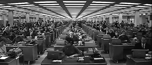
Billy Wilder’s The Apartment

Living Office concept by Herman Miller
In Billy Wilder’s 1960 comedy The Apartment, an anatomization of sex and power in the white-collar workplace that anticipated Mad Men by half a century, the great director offered a brutally funny, spot-on portrait of the postwar office, depicting the fictitious Consolidated Life of New York as a cornfield-size, perfectly rectilinear grid of anonymous, identical desks. How long ago and far away that seems. Though in places the old model still prevails, today’s ideal office paradigm could not be more different: fluid rather than fixed, less hierarchical and more egalitarian, and encouraging (mostly) of individuality, creativity, and choice.
A new story requires a new stage, and into this brave new world comes Herman Miller’s Living Office, the initial components of which the Zeeland, Michigan, furniture company is introducing at this year’s edition of NeoCon. The first wave of an anticipated two-year rollout, the Living Office’s first three product portfolios—called PUBLIC Office Landscape, Metaform Portfolio, and Locale, and designed, respectively, by fuseproject, Studio 7.5, and Industrial Facility—represent the company’s carefully considered response, not only to the ways in which a changed business culture has transformed workplace design, but to where our personal aspirations may be headed, and how the office can support them.
It’s a resolutely forward-looking vision. Yet this emphasis on what the company calls “human-centered problem-solving” has been the hallmark of Herman Miller since 1930, when Gilbert Rohde, its first design director, famously declared, “The most important thing in the room is not the furniture—it’s the people.”
In fact, the past is prologue to the Living Office in a central way—specifically, a slender, significant book, published in 1968, called The Office: A Facility Based on Change, by Robert Propst, at the time the company’s head of research. Under George Nelson, the second design director, Herman Miller had produced many of postwar America’s most iconic objects, by the likes of Charles and Ray Eames, Isamu Noguchi, and others, including Nelson himself. But by the late 1950s, the residential and commercial businesses had plateaued, and the company’s out-of-the-box-thinking president D.J. DePree began casting about for untapped revenue streams. DePree discovered Propst at the 1958 Aspen Design Conference, and was immediately taken with the artist/teacher/inventor. “Propst was truly brilliant, an innovative thinker,” explains Mark Schurman, Herman Miller’s corporate communications director. “D.J. figured, ‘We’ll set him up with a research division, and he’ll find new opportunities.’ One of his first directives was, ‘Anything but furniture.’”
Despite the company’s mandate, Propst became increasingly absorbed by the idea of reinventing the office, an interest that dovetailed with Nelson’s, who as early as 1948 had talked about the ideal working environment being a “daytime living room” that would be welcoming and humane. Propst, too, concerned himself with the human factor—specifically how flexible floor plans and porous, intercommunicating spaces might empower both the individual and the organization.
[…]
Action Office II’s 12 “principles of operation,” encouraged a workplace in which “the individual can participate in goal setting and thus behave like a manager at any level.” Propst’s environment remained “responsive to the goals of the user,” changed gracefully and with minimal disruption, and enabled rapid replanning. It also thrived on contrast: between neatness and chaos, sitting and standing, solitude and collaboration, privacy and community, and, critically, “geometry versus humanism”—that is, a traditional, grid-based floor plan versus a more organic layout.
[…]
Alas—and despite Propst’s injunction against the “four-sided enclosure”—by the late 1970s, the dominant application of the Action Office (and its multiple imitations) had become that most despised of office conditions: the cubicle. Propst, who died in 2000, had sought to liberate humankind from the grid, but his invention wound up locking the worker even more tightly into it.
Yet good ideas die hard, and the Living Office—which expresses Propst’s vision in a new-century way—suggests that, 45 years on, it’s an idea whose time has come. For one, when the Action Office appeared, the world depicted in Wilder’s film had its roots in the blue-collar assembly line, an essentially Victorian model. “There was a small group of people who made decisions, and a whole lot of people lined up executing,” says Greg Parsons, Herman Miller’s vice president of New Work Landscape. Today, Parsons points out, “the office is a facility based on creativity, and we need an organizational structure that reflects that.” As well, the anchoring effects of technology, which worsened in the 1980s and 1990s as ever more devices appeared, have been swept away in our wireless world. Both philosophically and physically, the office is far more flexibility-friendly than it was a half-century ago.
No less important is what might be called the Marissa Mayer Effect. Though the Yahoo! CEO’s ban on work-from-home may have been poorly handled, according to Gary Smith, director of design facilitation and exploration at Herman Miller, her point was powerful. “We’re talking about a shift of emphasis, away from housing and technology, capabilities that could exist only in the office,” Smith explains. “Now there’s a different thing that can exist only in the office, and that’s my access to you. I want to tap your potential, because what humans do best is connect and communicate”—something the Living Office is meant to encourage, by creating a multiplicity of differently scaled settings and making the connections between them more logical, adjustable, and fluid.
In keeping with its people-first philosophy, the company focused its predesign research on gathering insight, not information. “Research will expose the manifest behavior of a population, but it won’t reveal innovation,” observes Smith. Instead, Parsons says, “We asked, ‘What’s going on in the world? What’s fundamental about all human beings, and what do they really want to do?’” Toward this end, Herman Miller engaged in a process that Maryln Walton, of the insight and exploration group, describes as “informed dreaming.” Since 2001, the company has completed three rounds of scenarios, in which it looks five years ahead at potential futures; these enable the company to think about how the world might change, and adjust its product development and business strategies accordingly. The brainstorming process begins with a dozen people from different parts of the organization, followed by a two-day “expert workshop” with six individuals representing multiple disciplines—the most recent, which looked ahead to 2018, included two cultural anthropologists, a specialist in Asian HR policies, and a political science professor—to challenge the in-house assumptions.
The team then takes what it’s learned and imagines (and reimagines) the future until it arrives at three possible scenarios. For 2018, these include Datasphere, which looks at how the digital information generated by individuals worldwide can be innovatively repurposed; New Normal, a consideration of potential push-back against organizations, institutions, and governments; and Polarized World, in which the U.S. and China emerge as the two great economic powers. “We ran workshops with groups of people thinking about each scenario,” Walton says. “Then we spent a lot of time synthesizing the results, and developed what we believe are likely workplace realities in 2018.”
These realities— called propositions—are the gold nuggets sieved from the sand of the scenarios. “We don’t think any one of the three stories will come true,” says Walton. “But the eight propositions are things that we really believe.”
[…]
PUBLIC Office Landscape
Yves Behar & fuseproject


We found this statistic: 70 percent of collaboration happens at the workstation. This hit me like lightning, and I wrote on the project wall: “THE MAJORITY OF COLLABORATION HAPPENS AT THE DESK, YET DESKS HAVE NEVER BEEN DESIGNED FOR INTERACTION.” Our approach became to think of every place in the office, including one’s individual desk, as a place for collaboration. We came up with the notion of Social Desking.
[…]
We believe collaboration doesn’t just happen in conference rooms—it happens everywhere. PUBLIC Office Landscape supports fluid interactions and spontaneous conversations. The seating elements flow into desk surfaces, the fabric elements flow cleanly into hard surfaces. The result is a visual connection that encourages new functionality and casual postures.
[…]
“We’re trying to create Living Office products that function in group and community as well as individual zones,” Katie Lane, Herman Miller’s director of product development, tells me as we tour the cheerfully cluttered, bustling obeya space, the company’s fancy name (obeya is Japanese for “big room”) for the R&D skunkworks in its Design Yard, one of several facilities scattered around Zeeland. PUBLIC Office Landscape, the first system Lane showed me, supports areas in which two to six people typically cluster, and is designed specifically “for knowledge transfer and cocreation to occur,” she says. The heart of PUBLIC is the Social Chair, which supports the casual nature of the contemporary workplace by elevating the ergonomic levels of what looks at a glance like hip lawn furniture. Equally suited to perching, slouching, or sitting on the arm rests, the Social Chair, which can be easily pulled up to a desk or arranged in clusters, invites the quick chat or collaborative bull session, and supports what fuseproject principal Yves Behar (noting that “70 percent of short meetings happen at a person’s desk”) calls “collaborative density.” PUBLIC Office Landscape also speaks to one of the most compelling of the 2018 propositions: Swarm-Focused Work, in which—like bees—groups of individuals quickly zoom together to one spot to accomplish tasks.
Metaform Portfolio
Studio 7.5


Our approach was based on our observations in American offices: We saw a shift from individual to collaborative work patterns, we saw the walls being lowered to 42 inches to introduce natural light to the floor plan. We observed a huge amount of content and the transactions associated with work moved to the digital realm, leaving drawers and cabinets empty. We were looking for an environment to support the creative class.
[…]
Metaform Portfolio addresses a proposition called Hackable and Kinetic Nodes, a vision of the workplace as a campsite that can be arranged opportunistically and moved when necessary. The design challenge, according to Studio 7.5’s Carola Zwick, involved achieving “an architectural quality that can still be transformed by the inhabitants, since traditional planning cycles miss the needs and dynamics of today’s knowledge workers.” Accordingly, Metaform’s core element is a tiered block of polypropylene, weighing about 18 pounds, which can be combined with identical units to create a semi-enclosed space. The arrangement Lane shows me is formed into a half-circle, with squiggly shelves called Centipedes cantilevered off the tiers, and magazines and work displays tucked into the narrow spaces between them. An adjustable-height table, large enough for small-group collaboration, bisects the half-circle. Vertical versions of the shelving—called Vertipedes—are connected to the top tier and provide light visual screening.
Locale
Industrial Facility


In our office, we all travel from our own neighborhoods to a place where we can collaborate in person, so we thought: Why not design an office landscape that behaves like a good neighborhood? In our first thoughts we talked a lot about how social networks behave. Locale is a physical version of how social networks function; the most relevant participants are kept close so that communication is easy, fast, and frequent.
Locale works like a small high street where everything you need is clustered together. The architect or specifier can build small clusters out of different functional modules to form what we call a Workbase, so that the disparate functions of the office reside comfortably together. The library, social setting, working desk, and meeting table are al formed into an architectonic line.
In Sam Hecht and Kim Colin’s Locale, “individual work areas mix with group and collaborative elements to give a high-performance team everything it needs within a neighborhood on the floorplate,” Lane explains, leading me into a zone shaped by standing-height screens, storage/shelving units incorporating sliding easels, and with a low circular coffee table, stand-alone refreshment center, and a row of curved adjustable-height desks. Locale grew out of what Hecht calls an “autobiographical approach” to design, wherein he and Colin thought about how unnatural it felt to have an impromptu get-together in their own office. “You’re sitting, they’re standing, it’s not very productive,” he explains. “We wanted to create a system in which people would collaborate very naturally—every table can be a meeting table.”
[…]
Greg Parsons recalls, “We came up with ten modes of work that are repeated in virtually every organization”—including “administer,” “contemplate,” “create,” “quick chat,” “converse,” “warm up/cool down,” and “gather and build”—“and tied them to the kinds of settings we can create,” he says.
Once an organization’s programmatic needs are understood, and what the mix of work modes might be, Gee’s group develops study plans that suggest how an office’s square footage can be best apportioned. The ones she showed me resemble urban site plans, which seems appropriate: A well-functioning business environment, after all, is akin to a neighborhood, different parts of which cater to varying needs and interactions. “Our team uses a lot of urban planning metaphors when we talk about this,” Gee says. “Because getting the settings right is just part of the equation. That would be like getting one building right in a whole city.”
The Cubicle You Call Hell Was Designed to Set You Free | Design | WIRED
The Cubicle You Call Hell Was Designed to Set You Free | Design | WIRED.

Action Office I promotional image

Action Office II
In 1964, the iconic furniture design company Herman Miller unveiled an office plan unlike anything anyone had ever seen. Called Action Office, it was the brainchild of Robert Propst, who was among the first designers to argue that office work was mental work and that mental effort was tied to environmental enhancement of one’s physical capabilities. Rather than a furniture item or a collection of them, Action Office was a proposition for an altogether new kind of space.
Most office designs at the time were about keeping people in place; Action Office was about movement. Advertisements for the system show workers in constant motion; indeed, the human figures in the images often appear blurred, as if the photographer were unable to capture their lightning speed.
[…]
The items Nelson had designed for Action Office were beautiful, at once homey and utterly modern, nostalgic and forward thinking. His desk surfaces rested on cantilevered die-cast aluminum legs; for the standing desk, a chrome brace doubled as a footrest. A “communications center” with a telephone was acoustically insulated.
There were many idiosyncratic touches. Because Propst had convinced himself that work out of sight was work out of mind, there were no large desk drawers. Instead, there was a movable display surface, from which items could be retrieved and replaced at ease. A standing rolltop desk not only kept workers on their feet but also allowed them to leave work out overnight, securely closed.
Above all, it was colorful: green, bright blue, navy blue, black, and yellow. Like bright magazine advertisements, or the Pop Art of Warhol and Lichtenstein, Action Office proclaimed its allegiance to the new spirit of the age: rich, advanced, potentially liberating.
In this sense, the Action Office that Propst had conceived and Nelson designed might have been the first truly modern idea to enter the office—that is, the first in which the aesthetics of design and progressive ideas about human needs were truly united.
[…]
Despite the rapturous reviews, Action Office didn’t sell. Office managers complained that the entire system was too expensive, because the furniture was made of such quality material. And the space that Action Office created was too vaguely defined, its borders too porous.
The product won a few awards within the industry but otherwise saw little actual adoption in the workplace.
[…]
Propst had run up against a classic problem of design. Office planners and architects tend to imagine that the setup of their own offices should be the way that everyone should work. They pretend that their own subjective methods are objective empirical results.
The failure of the first Action Office on the market might finally have been due to another factor: the cynicism of executives. They had the final say on how their offices looked, since they controlled the bottom line, and the last thing they were going to drop a ton of money on was a set of fancy chairs and desks for their junior and middle managers, let alone the steno pool. And office space was growing at too fast a volume for anyone to be concerned about niceties. Something faster was needed, something more easily reproducible.
[…]
The concept that Propst came to reiterate again and again was that office design needed to be “forgiving.” That is, overly designed and stylized spaces were “unforgiving,” barriers against change, and change was coming into the office one way or another.
Computers were automating more and more processes, allowing office workers to reduce routine tasks to focus more on “tasks of judgment.” What an office design had to do was anticipate these changes as best as it could, through modularity and flexibility. It had to be adaptable, movable. This meant that “design” itself had to be tossed out: anything that made his concept more expensive and less “forgiving” to user needs was against the concept.
[…]
The predilection for beauty of the object was an obstacle in Propst’s eyes; it detracted from the beauty of the office worker’s motion in space.
By the end of 1967, Propst had made significant improvements. The space was smaller; the interlocking walls were mobile, lighter, and made of disposable materials; storage space was raised off the ground.
Action Office II was Propst’s attempt to give form to the office worker’s desire. A “workstation” for the “human performer,” it consisted of three walls, obtusely angled and movable, which an office worker could arrange to create whatever workspace he or she wanted.
The usual desk was accompanied by shelves of varied heights and variable placement, which required constant vertical movement on the part of the worker. Tackboards and pushpin walls allowed for individuation. Intentionally depersonalized, the new Action Office would be a template for any individual to create his or her own ideal work space.
[…]
Steelcase’s 9000 series and Knoll’s Zapf System soon followed.
But the copycat Action Offices were starting to have strange, unforeseen effects on other workplaces. Rather than making them more flexible, they in fact appeared to be making them more regimented.
Douglas Ball, a designer for the rival furniture company Haworth, came up with one of the many knockoff designs for the Canadian company Sunar. Initially excited, he emerged from the completed space utterly depressed. “I went to see the first installation of the Sunar system, a huge government project. The panels were all seventy inches tall, so unless you were six-foot-three you couldn’t look over the top. It was awful—one of the worst installations I’d ever seen,” Ball said. “We thought it was extremely flexible in the plan view, but we had never considered the vertical elevation.”
And it was too late to fix the problem. He had trapped people in giant fabric-wrapped walls, when he had meant, like Propst, to free them.
It turned out that companies had no interest in creating autonomous environments for their “human performers.” Instead, they wanted to stuff as many people in as small a space for as cheaply as possible as quickly as possible.
By 1978, Propst was composing memos on repositioning his design, panicked over the obsession with “easily defined and accountable cost savings.” “Meanwhile, other matters of more profound influence on the real productivity of organizations have slipped into the background,” he worried.
Action Office had been meant for flexibility; instead, a new rigidity set in—though it was wrapped disingenuously in humanistic fabric. Propst’s memos seemed to have no effect. Soon the designs for Action Office in the Herman Miller brochures began to seem more box-like. They were selling what the companies wanted.
[…]
“The dark side of this is that not all organizations are intelligent and progressive,” Propst says. “Lots are run by crass people who can take the same kind of equipment and create hellholes.”
Propst noted that his design proved irrepressibly popular: 40 million employees in America alone worked in 42 different versions of the Action Office. But he failed to note that by that point they were all known by the same name: the cubicle.
Action Office – Wikipedia, the free encyclopedia
Action Office – Wikipedia, the free encyclopedia.


Action Office II by Herman Miller
The Action Office is a series of furniture designed by Robert Propst, and manufactured and marketed by Herman Miller. First introduced in 1964 as the Action Office I product line, then superseded by the Action Office II series, it is an influential design in the history of “contract furniture” (office furniture). The Action Office II series introduced the concept of the flexible, semi-enclosed workspaces, now better known as the cubicle. All cubicle office designs can be traced back to Herman Miller’s Action Office product lines.
[…]
Herman Miller Research Corporation’s mission was not to address problems with furniture itself, but to solve problems related to the use of furniture. The corporation’s first major project was an evaluation of “the office” as it had evolved during the 20th century — particularly how it functioned in the 1960s.[1] Propst’s studies included learning about the ways people work in an office, how information travels, and how the office layout affects their performance. He consulted with Joan Evans (scholar of ornament and pattern), Terry Allen and Carl Frost (Michigan State University psychologists), Robert Sumner (who investigated the effects of different spaces on mental health), Edward T. Hall (anthropologist and author of the 1959 book, The Silent Language[2]), as well as with a number of specialists, including mathematicians and behavioral psychologists.[1]
Propst concluded from his studies that during the 20th century, the office environment had changed substantially, especially when considering the dramatic increase in the amount of information being processed. Despite the change in what an employee had to analyze, organize, and maintain on a daily basis, the basic layout of the corporate office had remained largely unchanged, with employees sitting behind rows of traditional desks in a large open room that was devoid of privacy. Propst’s studies suggested that an open environment actually reduced communication between employees, and impeded personal initiative. On this, Propst commented that “one of the regrettable conditions of present day offices is the tendency to provide a formula kind of sameness for everyone.“ In addition, the employee’s bodies were suffering from long hours of sitting in one position. Propst concluded that office workers require both privacy and interaction, depending on which of their many duties they were performing.[1]
[…]
Action Office I
Propst and the Herman Miller Research Corporation formulated a plan to address the problems plaguing office workers of the time, which George Nelson’s team realized in the form of the Action Office I. It was introduced in the Herman Miller lineup in 1964.[1][3] Action Office I featured desks and workspaces of varying height that allowed the worker freedom of movement, and the flexibility to assume the work position best suited for the task. Action Office I was ideally suited to small professional offices in which managers and employees often interacted using the same furnishings. However, Action Office I was expensive, difficult to assemble, and wasn’t suitable for offices at large corporations.
[…]
Action Office II
Propst was free to explore his concept of an office that was capable of frequent modification to suit the changing needs of the employee, without having to purchase new furnishings. He wanted to allow the employee a degree of privacy, and the ability to personalize their work environment without impacting the environment of the workers around them. Propst recognized that people are more productive within a territorial enclave that they can personalize, but also require vistas outside their space. His concept was the “back-up,” a two or three sided vertical division that defined territory and afforded privacy without hindering the ability to view or participate in happenings outside the space.[1]
Action Office II was based around the mobile wall unit that defines space. The unit also supported multiple workstation furnishings that benefited from the vertically oriented work space. The components were interchangeable, standardized, and simple to assemble and install. More importantly, they were highly flexible, allowing the company to modify the work environment as needs changed.[1]
The Action Office II lineup was an unprecedented success,[according to whom?] and was quickly copied by other manufacturers.
Despite the Action Office II line becoming Herman Miller’s most successful project, George Nelson distanced himself from any connection with the project.[2] In 1970, he sent a letter to Robert Blaich, who had beome Herman Miller’s Vice-President for Corporate Design and Communication, in which he described the system’s “dehumanizing effect as a working environment.” He summed up his feeling by saying:
One does not have to be an especially perceptive critic to realize that AO-II is definitely not a system which produces an environment gratifying for people in general. But it is admirable for planners looking for ways of cramming in a maximum number of bodies, for “employees” (as against individuals), for “personnel,” corporate zombies, the walking dead, the silent majority. A large market.[2]
Scornful as he may have been, Nelson was correct in stating that there would be a “larger market” for Action Office II. By 2005 total sales had reached $5 billion.[2]
Coherent Structures
Propst’s last contribution to the Action Office lineup was a series of furnishings designed specifically for the hospital and laboratory setting. Known as Coherent Structures, the series of highly mobile containers, frames, carts, storage devices, and rails were introduced in 1971.[1] Designed to streamline the service functions of a hospital environment, they were highly successful until the advent of centralized computer systems made such portability of documents obsolete.
Ethospace
Designed by Jack Kelley, who worked on the design of both Action Office I and Action Office II, Ethospace enhanced the wall elements of the Action Office II system. Kelley changed the wall units to highly varied — but standardized — tiles that could simply slide into a frame and be finished with end caps. By selecting new Ethospace tiles, one could quickly change the color, texture, function, and character of the workspace without dismantling the frame or disrupting work flow.[1]
[…]
In 1997, Robert Propst said that he had hoped that his idea would “give knowledge workers a more flexible, fluid environment than the rat-maze boxes of offices,” but regretted that his idea had evolved to some extent into just that, saying that “the cubicle-izing of people in modern corporations is monolithic insanity.”[5]
[…]
Action Office furnishings have appeared in many films released within the last thirty years. The first film to feature Action Office products was Stanley Kubrick‘s 2001: A Space Odyssey, released in 1968. In the film a white Action Office I roll-top desk is used in the space station reception area.

